Skip to content
Home
Plugins
Beaver Builder CSS Grid
Beaver Builder Flexbox
My Account
Contact
Log In
CSS Grid Examples
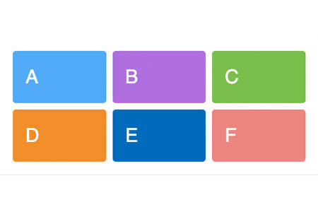
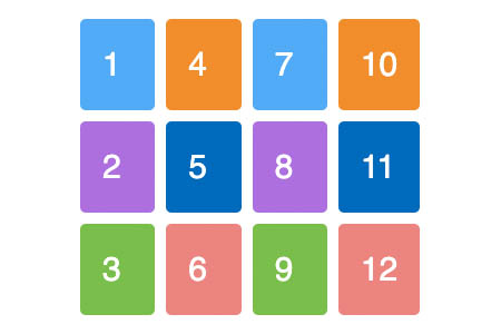
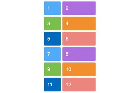
Defining a Grid
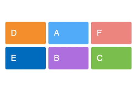
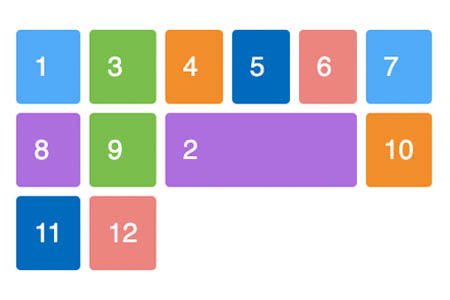
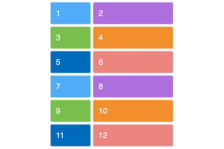
Line-based placement
Line-based placement shorthand – grid-row and grid-column
Line-based placement shorthand – grid-area
Line-based placement spanning tracks
Line-based placement spanning tracks with the span keyword
Line-based placement named lines
Line-based placement named lines with spans
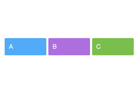
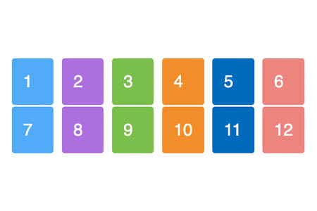
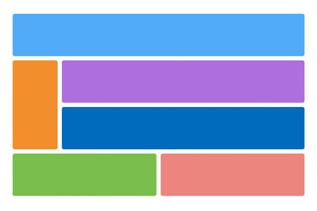
Using repeat notation
Explicit and Implicit Grid
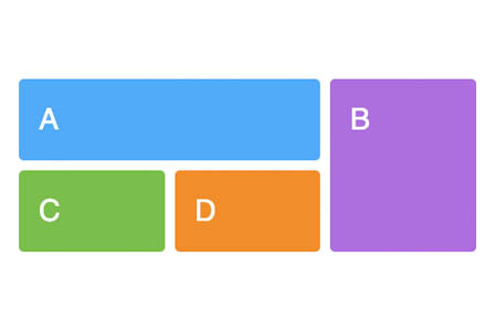
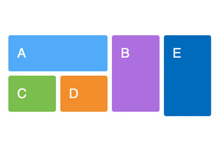
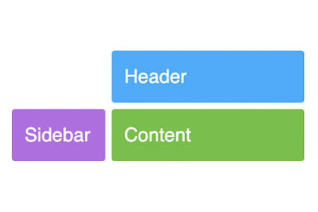
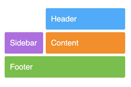
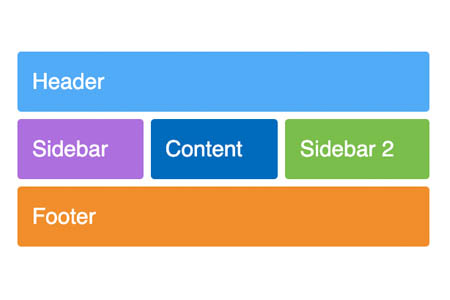
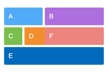
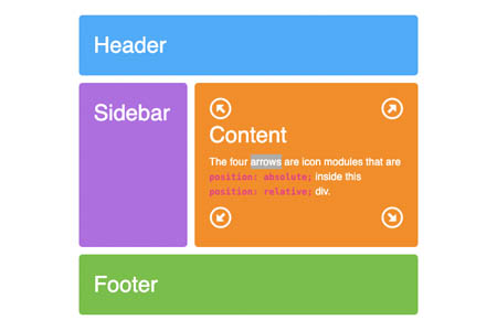
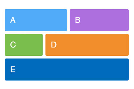
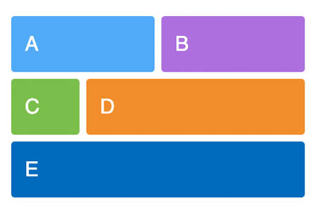
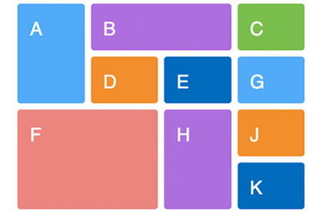
Defining Grid Areas
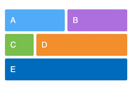
No clearing required
Redefining Grid Areas with Media Queries
Source Independence
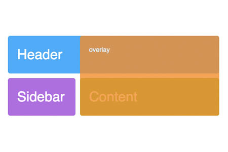
Layering items
A grid item as a new positioning context
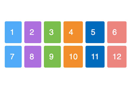
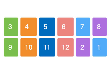
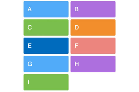
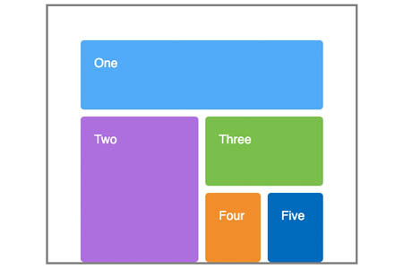
Grid auto-placement
Grid auto-flow column
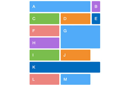
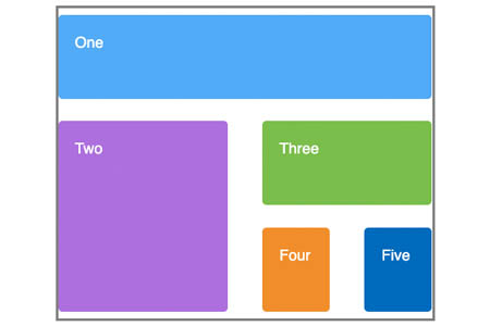
Grid auto-placement mixed with placed items
The auto-fill keyword in repeating track definitions
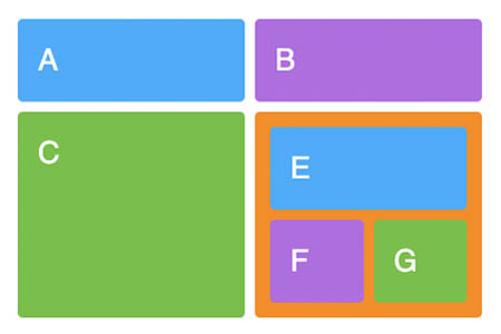
Nested Grid
Implicit named grid lines
Using Order
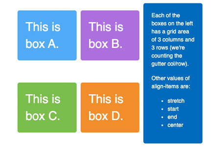
Box alignment align-items
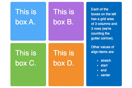
Box alignment justify-items
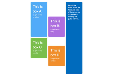
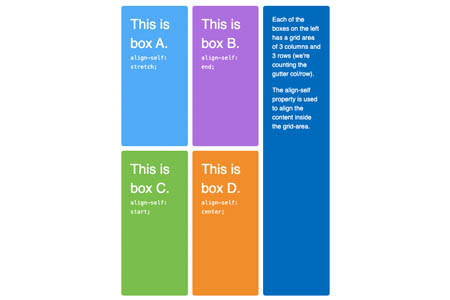
Box alignment align-self
Box alignment justify-self
minmax() in auto-fill repeating tracks
minmax() and spanning columns and rows
The auto-fill keyword with named grid lines
A simple minmax example
Aligning the Grid
Aligning the grid with space-around and space-between
Multiple tracks in a track-list with auto-fill
Multiple tracks in a track-list with auto-fill and minmax()
Percentage based grids and gaps
auto-fill vs. auto-fit
grid-auto-flow
Using nth-child() to set up your grid-area
Use the Photo Module to Create a Responsive Modular Grid
Use the Posts Module to Create a Three-Part Horizontal Masonry Grid
Row Content Width: Full-Width Background and Fixed Content
Use the Post Module to Create a Responsive Modular Grid
Layers