Beaver Builder CSS Grid
The CSS Grid Layout offers a two-dimensional grid-based layout system with rows and columns, making it easier to design web pages without having to use floats and positioning.
Watch the first two minutes of this video. That's all it took to spark my curiosity about CSS Grid, and I soon came to realize how powerful it could be when used with Beaver Builder.
CSS Grid Changes Everything
The Beaver Builder CSS Grid plugin creates a seamless integration between Beaver Builder and CSS Grid. Here are some examples:
Beaver
Builder


CSS Grid
Two Modes to Choose From
Simple
If you have little to no experience with CSS Grid, the Simple Mode is perfect for you! All of the essential CSS Grid rules are laid out in easy to use responsive options. Plus it comes loaded with tooltips to help you learn more about each setting.
Scroll through the Simple options:

Advanced
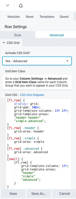
For those who are comfortable with CSS and just want type and be done, the Advanced Mode is just what you need. Get in, type a few lines of CSS, and get out! I also included some shortcodes to help out with row and column handling, as well as responsive media queries.
Scroll through the Advanced options:


Beaver
Builder


CSS Grid
Why You Need This In Your Life
Annual License
- Unlimited Websites
- One Year of Support & Updates
- 14-Day Money Back Guarantee
Lifetime License
- Unlimited Websites
- Support & Updates for Life
- 14-Day Money Back Guarantee
