Beaver Builder Flexbox
The Flexible Box Layout offers a one-dimensional flexible layout system with columns, making it easier to design web pages without having to use floats and positioning.
Beaver Builder Flexbox offers an alternative way of positioning Beaver Builder Columns and Modules side by side. Using Flexbox allows for greater flexibility, more columns, and better responsive handling.
Beaver Builder Flexbox
Something I've seen my fellow builders request over and over is the ability to have more columns in Beaver Builder.
Their documentation states:
A main column group can have a maximum of 12 columns.
It also states:
A child column group can have a maximum of four columns.
I've had many situations where this simply isn't enough! In the past, I've had to make do by creating Bootstrap grids using HTML, but this doesn't allow for dragging modules inside those column grids.
So then I switched to using custom CSS classes and rules to turn a single BB column into multiple Flexbox columns. This method works great, but takes time to set up and can be confusing to someone who doesn't have good CSS knowledge.
That's why I created the Beaver Builder Flexbox plugin!!! It takes all of the CSS coding out of the equation and easily turns a single Beaver Builder row or column into multiple responsive Flexbox Columns.
Advantages
I made this plugin to solve 2 issues I have with Beaver Builder.
More Columns
Beaver Builder Flexbox lets you easily turn a single Beaver Builder Column into multiple Flexbox columns!
This is especially useful for child columns where we are normally limited to 4 per layer.
Better Responsive Handling For Column Groups
I love how easy Beaver Builder makes it to have different settings for small and medium devices. However, there are certain situations where this doesn't work well for column groups.
Beaver
Builder
Flexbox

Options for Flex Containters & Flex Items
Flex Container Options
When Flexbox is activated in a Row or Column, it becomes a Flex Container (Flex Parent).
- When a Row is the Flex Parent, its Column Groups become the Flex Items (Flex Children).
- When a Column is the Flex Parent, its Modules and Child-Column Groups become the Flex Items.
Scroll through the Flexbox options:

Flex Item (Flex Child)
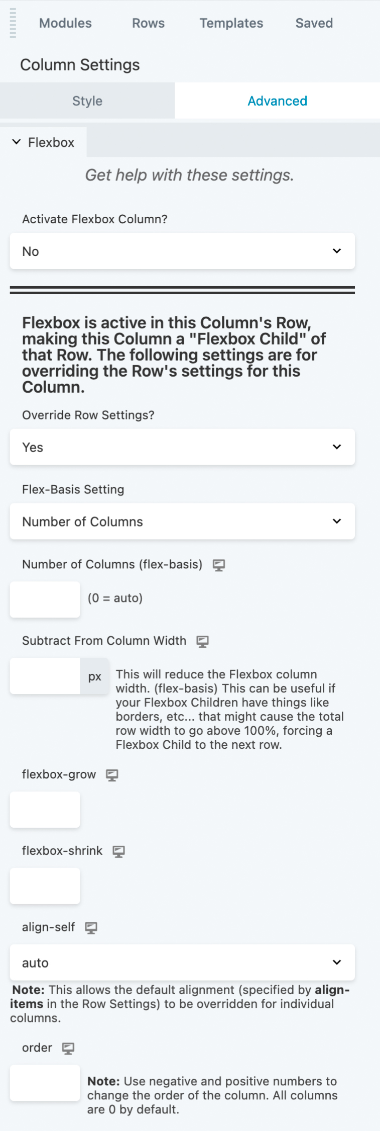
The Flexbox options in a Row or Column will affect all of the Flex Items the same. However, you can override some of those options on an individual basis for each Flex Item.
- When a Row is the Flex Parent, you will see these override options appear in the Column settings.
- When a Column is the Flex Parent, you will see these override options appear in the Module and Child-Column settings.
Scroll through the Override options:


Beaver
Builder
Flexbox

Why You Need This In Your Life
Annual License
- Unlimited Websites Sites
- One Year of Support & Updates
- 14-Day Money Back Guarantee
Lifetime License
- Unlimited Websites Sites
- Support & Updates for Life
- 14-Day Money Back Guarantee
